How to Match Sanitaryware with Vanity and Countertop Materials
Most bathroom design mistakes are not made at the product level. They are made at the coordination level — when a flawless wash basin is set against a countertop that fights it, or when a vanity finish makes the sanitaryware look like it belongs in a different room entirely. Getting these relationships right is less about individual product quality and more about understanding how materials, finishes, and forms speak to one another across a space.
Start with the Sanitaryware Finish — It Sets the Tonal Register
Sanitaryware is typically the largest fixed surface in a bathroom. It anchors the palette whether you intend it to or not — so it should be the first design decision, not the last.
Standard white gloss sanitaryware reflects light actively, lending a bathroom visual volume and clinical crispness. It pairs with almost any countertop or vanity material because it doesn't compete — it recedes into neutrality and lets the surrounding materials lead. This is both a strength and a limitation. Against a heavily veined Calacatta marble slab, brilliant white gloss can feel stark. Against a warm travertine or a timber vanity, it can read as cold.
Matte white sanitaryware absorbs light rather than reflecting it, producing a softer, more architectural quality. The reduced contrast between sanitaryware and countertop allows stone, concrete, or engineered surfaces to read as continuous rather than interrupted.
Off-white, bone, and greige sanitaryware — less common in the premium segment but available — introduce warmth that reads more naturally against natural stone, aged brass fittings, and warm-toned timber. They rarely work alongside cool-veined marbles or high-gloss lacquer vanities.
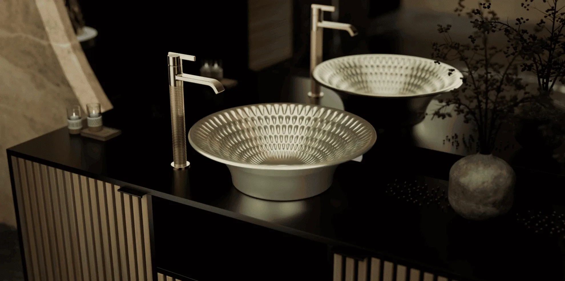
Senator's Ivana collection, crafted in Fine Fire Clay with a refined thin-rim rectangular profile, is available in both classic white and matte black — a deliberate design decision that positions the basin as either a recessive element or a focal statement depending on what surrounds it.
Stone Countertops: Matching the Visual Weight of the Material
Natural stone countertops — marble, quartzite, granite, Nero Marquina — carry significant visual weight. The sanitaryware and basin specified alongside them must be able to hold their own without competing directly.
Calacatta and Statuario marble (white ground, bold grey or gold veining) read best alongside simple, architecturally resolved basin forms. Heavily sculptural or decorative basins fragment the visual hierarchy that the stone establishes. A clean under-counter basin in matte white — or a semi-recessed basin with a thin profile — allows the stone slab to remain the primary surface. The Pure Soft sanitaryware range, with its resolved, minimal geometry, works precisely in this context.
Nero Marquina and black-veined marbles create a strong ground that reads well against both matte white basins and the contrast play of matte black. A matte black table-top basin — as offered in the Ivana range — on a Nero Marquina slab creates a tonal continuity that avoids the expected white-on-black contrast while maintaining depth.
Travertine and warm-toned limestones have a natural, slightly rough grain quality. Pairing them with high-gloss sanitaryware creates a surface tension that rarely resolves well. Matte or honed-finish basins echo the material's anti-specular quality and allow the stone's texture to remain dominant.
Engineered stone and sintered surfaces (Dekton, Neolith, Silestone) offer the visual language of stone with greater colour consistency. They work with a wider range of basin forms — including more expressive, sculptural designs — because the surface itself does not impose as strong a narrative as natural stone.
Vanity Material and Basin Typology: A Structural Relationship
The vanity material determines where the eye travels after the basin — and the basin typology (table-top, under-counter, wall-hung, semi-recessed) fundamentally changes how the vanity reads as a piece.
Lacquered vanities — high-gloss or matte lacquer in mono-tones — are highly resolved surfaces that assert a precise, contemporary language. They work best with basins that match that precision: under-counter installations that keep the countertop surface continuous, or thin-rim table-top basins where the profile is tight enough to feel designed rather than applied. Chunky, organically formed basins placed atop a clean lacquered vanity create a category conflict — two different design philosophies in direct conversation.
Natural timber and wood-veneer vanities introduce warmth, grain, and a degree of visual complexity. They pair naturally with white or off-white matte basins — the neutrality of the basin lets the wood read without competition. Wall-hung basins above an open timber vanity shelf create a floating composition that emphasises the material's grain quality. The Designer Art Basins in the Senator range — with their distinctive sculptural profiles — can function as counterpoints to a simple timber surface, provided the basin form is strong enough to justify the contrast.
Stone-veneer and full-stone vanities (including waterfall-edge slabs) are among the most demanding pairing contexts. The vanity is already the statement. The basin must either integrate seamlessly — an under-counter installation that becomes part of the stone mass — or be explicitly designed as a contrasting object. The award-winning Visqua Wash Basin occupies this second role: a piece whose form is resolved enough to hold its own alongside a dominant material.
Concrete and microcement vanities read as minimal, textural, and industrial-leaning even within luxury contexts. They suit wall-hung or semi-recessed basin configurations in matte finishes. The texture of concrete does not pair easily with gloss-finished sanitaryware — the surface contrast reads as accidental rather than considered.
Faucet Finish: The Connective Element Most Designers Underestimate
The faucet is the one element that touches both the sanitaryware and, often, the countertop or deck surface — making it the material connector across the pairing. Its finish should be chosen last, in response to what the basin and vanity have established.
Brushed gold and PVD brass introduce warmth that softens cold stone pairings — Calacatta with a brushed gold basin mixer reads warmer and more residential than the same stone with chrome. Matte black faucets are not a universal neutral; they work with resolution against stone, concrete, or timber, but can read as heavy against light-toned lacquer vanities unless used intentionally as a contrast point.
Brushed nickel and gunmetal occupy the middle register — they sit comfortably between the warmth of gold and the coolness of chrome without asserting a strong directional character.
Chrome, despite its associations with standard specification, remains the most versatile finish in high-contrast or maximalist contexts because it reflects its environment — it takes on the colour character of whatever surrounds it.
Senator's Lorian and Fluidique faucet ranges are available across multiple finishes for precisely this reason: the engineering is constant, but the material language shifts to meet the context the designer has established.
Three Coordination Mistakes That Undermine Expensive Material Choices
Competing texture scales. Pairing a heavily textured basin (hammered, rough-cast, or highly articulated surface) with a strongly grained stone countertop creates visual noise. In premium bathroom design, texture is usually assigned to one primary surface — the stone, or the basin, rarely both simultaneously.
Finish temperature mismatch. Warm-toned vanity timber with cool chrome fittings and brilliant white gloss sanitaryware creates a finish temperature conflict — the room pulls simultaneously towards warmth and coolness without resolving in either direction. Establishing a consistent temperature register (warm or cool) across sanitaryware finish, faucet, accessories, and vanity hardware brings cohesion.
Ignoring edge profile. The edge detail of a countertop — whether square-edge, pencil-round, waterfall, or mitred — should inform the basin profile specified alongside it. A sharp square-edge slab paired with a softly rounded under-counter basin creates an edge-language conflict that is subtle but consistently noticed. The Expression collection, with its considered geometric resolution, is designed with this relationship in mind.
Frequently Asked Questions
Q: Should the sanitaryware always be white in a luxury bathroom? A: Not necessarily. White remains the most versatile choice, but matte black, greige, and off-white sanitaryware are increasingly specified in premium projects where the vanity and stone palette are warm-toned or where a tonal rather than contrasting relationship is desired.
Q: What countertop material works best with a designer art basin? A: Architecturally minimal countertop surfaces — plain-slab engineered stone, microcement, or simple timber — allow a statement basin to read as intended. Heavily veined natural stone competes with the basin's form rather than supporting it.
Q: How do I choose between an under-counter and table-top basin? A: Under-counter installation keeps the countertop as the primary material statement and suits high-spec stone slabs. Table-top basins assert themselves as designed objects and suit contexts where the basin is meant to lead — particularly with simple or matte-finish vanity surfaces.
Q: Can matte black sanitaryware work in a light-toned bathroom? A: Yes — effectively, if handled as a deliberate contrast element rather than a default specification. Matte black sanitaryware in a white or light stone bathroom requires the rest of the hardware — faucets, accessories, mirror frames — to follow the same finish to avoid it reading as an isolated decision.
Q: Is there a reliable rule for matching faucet finish to countertop material? A: Warm-toned stones (travertine, honey onyx, golden quartzite) pair most naturally with brushed gold or warm brass. Cool-toned stones (white marble, Nero Marquina, grey slate) suit chrome, brushed nickel, or matte black. Timber vanities work across both warm metal finishes and matte black, depending on the wood tone.
Conclusion
The most resolved luxury bathrooms are not those with the most expensive individual products — they are the ones where every material decision was made in reference to the others. Sanitaryware, countertop, vanity, and faucet finish are not independent choices. They are a system, and coherence across that system is what separates a bathroom that photographs beautifully from one that lives beautifully.
Senator's collections — from the sculptural Designer Art Basins to the refined geometry of the Ivana range — are designed with this coordination in mind. If you are specifying a bathroom and want to explore how Senator's sanitaryware and basin range can be matched to your material palette, speak with our team.

